
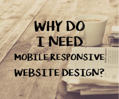
Today’s world of website design and the way customers consume information has drastically changed. Where it would have sufficed to design for particular monitor screen sizes, today it is imperative to consider the variety of different screens (smartphones, smartwatches, laptops) and design according to specifications that will be versatile across all platforms. For this reason, when having a website designed, you will actively want to consider making sure that the design you are paying for is mobile responsive website design.
Benefits of Mobile Responsive Website Design
 There are so many reasons to be sure your website is mobile responsive. Once you see the benefits of making sure your website is both mobile and responsive (and there are many), you will want to ensure that the next site you have developed is, indeed, mobile responsive. Let’s look at a few of these benefits in detail.
More People are Using Mobile
Statistics show that more than 58% of American adults currently own a smartphone. Also, nearly 60% of general web traffic comes from mobile devices. As these numbers are steadily climbing, it’s essential to ensure that your website can compete with the market and also has a mobile presence. If more people are using mobile than desktops, then you want to make sure your website is where consumers are. You should be making sure that your site is adaptable for their needs, thereby increasing your chance for website success.
Adapts to any Screen Size
Adaptability on different devices is essential. Web design should look great on multiple devices and screen sizes, and it’s quite convenient to have your website adjust itself to suit each particular screen size. When a site is mobile responsive, you don’t need to worry about the text being jumbled and images not aligning. It is a smooth and seamless transition from one device to another.
Improves Your SEO Rankings
Search engines such as Google tend to rank responsive sites higher due to the better user experience. There is less scrolling and zooming involved which also makes it easier for users. Also, because your site is more comfortable to navigate, you have an opportunity to increase your dwell time, causing users to stick around longer to your quality content, therefore improving SERPs.
Shopping on Mobile is Growing
According to Marketpath, 80% of consumers use their smartphones on a regular basis to shop online. Shoppers want convenience, and having a desired product be a click or swipe away on their smartphones makes shopping incredibly easy. In summary, it is critical to understand why having a mobile responsive website designed is crucial. Many people are using mobile only these days, it improves your SEO rankings, it adapts to different screen sizes, and finally, many people shop via mobile. To find out how you can have your responsive website developed, reach out to Paradux Media Group and see how we can be of help to you.


Quacktastic Reviews:
“Tisha and Garrett have been wonderful to work with. They are very knowledgeable about websites, marketing, SEO. They have both been prompt and efficient in…
We love working with Paradux. They are very professional, always responsive, learn very quickly about a wide variety of businesses and industries, and produce first-class…

“Paradux is top notch – they know their stuff and always take excellent care of me. I get so many compliments on my website! I’ve…
We love working with Tisha and Paradux. They are professional, very responsive, and are able to dive in and learn about a wide variety of…
I loved working with Paradux on updating our website to look more modern! They are very responsive and incredibly fast at getting things done. I’m…

“Paradux worked quickly and efficiently to quickly get an ad campaign together for our biggest annual fundraising event. I will be using them every year…

“I loved working with Paradux on updating our website to look more modern! They are very responsive and incredibly fast at getting things done. I’m…

“The team at Paradux was wonderful to work with. Their expertise, assistance, grace, and personality were such a joy in our partnership on a video…

Always willing to work with us on our (sometimes very specific) marketing needs.
