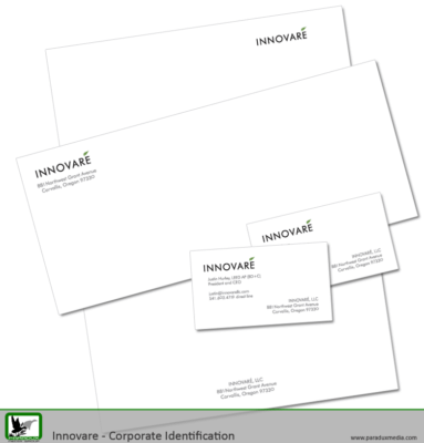
The next step on the Finding Brand journey is to begin looking at and updating your corporate identity (ID). (Don’t miss out, you can catch up here.) Corporate ID is your letterhead, fax covers, business cards, PowerPoint Templates, envelopes, and statements. Anything that comes from your company in an “official” capacity is part of your corporate ID. So take a quick moment and start a list of what your corporate ID includes. You’ll add to this list as you work through the process, but for now, get it started. You won’t need any special programs to do this, although a picture editor and/or word processor will make it easier. This is about you being creative, so find your creative hat and let’s get started.
Your Brand Identity Design Should be the Cornerstone
Remember your manifesto and tagline? Good, that is the attitude you need to bring to your corporate identity. Is it Fresh? Fun? Steady? Solid? Now that’s the feeling you want to create with your identity. That feeling will translate to the fonts you use, card/paper stock you choose, the colors you use, and the graphics you utilize.
 When you’re choosing fonts, remember you don’t want to use any more than three fonts in any document. It simply gets too cluttered. This would include ALL CAP treatment, italics, and actual font changes — 3 is plenty, resist the urge to add 4 or more! But do choose something distinctive that blends both the attitude in your tagline with the look of your logo. You’re also going to have to choose something that is easy to read as this is the primary way people will contact you. Too fancy a font that is too difficult to read is not going to help someone decipher that email address without their glasses on.
Is there a graphical element in your logo that you can pull out and use to create something visually appealing on your Corporate ID? Say your logo has a tree (or a circle, mountain, etc.) in it, consider using an outline or block printing of that image as a graphical element in the corporate ID. Try using this element in a large size, washed out as a watermark on your corporate ID.
Also, try to put your tagline on the document somewhere. This will help to reinforce the feeling you want the viewer to have about your company. Choose a distinctive font that you will use for your tag line, let it also become a graphical element for you.
Once you have your fonts and your graphics, think about how you can layout the information in a visually appealing manner. Play around with it, start with letterhead — it’s the easiest. Once you have the letterhead look locked down, try a fax cover sheet or statement.
The Business Card
Now comes the harder part — the business card. Why harder? You have to put more information in a smaller space. But if you’ve got a good look going for the letterhead and fax cover sheet, you’ll be able to manage the business card. After that, it’s just a matter of setting up a PowerPoint template (if you use it in your business),
Just remember your goal here is to make people FEEL about your business the way your tagline represents it.
- Published: July 7, 2010
- Author: Tisha Oehmen
- Blog: Finding Brand Blog
- Category:
- Tags: brand, Brand Creation, Brand management, Branding, Business card, Communication Design, corporate identity, declaration of passion, email, graphic design, Letterhead, logo, Manifesto, marketing, Personality, Tagline, Telling Your Story
- Comments:
Quacktastic Reviews:
Excellent team to work with! Mike and Tisha are fantastic at coming up with new ideas while staying true to my companies vision, values, and…

Operating a restaurant and bar is hard enough. It demands wearing many hats. Promotions and marketing is not one of them any longer since we…


Can not recommend this team enough. What started as a one-time website re-design has evolved into Paradux handling the vast majority of our marketing. Business…


We would not be able to run as smoothing, quickly, or efficiently if it was not for Paradux Media Group. Tisha and team is hands…


Recently, I had the opportunity to work with Paradux Media on a website build, and I just couldn’t have been happier with the process and…


Mike and his team are well known within the region and marketing community as an insightful industry leader. If you are looking for a Marketing…


Paradux Media is a very professional group, and they know what they’re doing. Whether they are placing buys for clients, or producing high-quality TV spots,…


Paradux helped build my business in all capacities. Without them, I would never have had the resources and ability to get so much accomplished –…


Mike, Tisha, and the team can build you anything you want for your company or small business. Very knowledgeable and easy to work with. They…


As a long-time client of Paradux, I can confidently say that their creative team is one of the best in the business. They consistently produce…


