

Hidden Messages in Logos: What Great Logo Design Teaches Us, Part 2
Discover hidden meanings in logos and what clever use of negative space, symbolism and visual storytelling can teach us about logo design.

A while back, I shared some of my favorite examples of hidden messages in logos. Apparently, I’m not the only person who enjoys discovering that the logo I’ve looked at a hundred times has been quietly doing something clever the entire time.
What makes a clever logo effective?
A clever logo works when the visual idea supports the brand rather than distracting from it. Hidden meanings, negative space, symbolism, or wordplay can make a logo more memorable, but the mark still needs to be recognizable, useful, and appropriate even when someone never notices the hidden detail.
 So, naturally, I went looking for more.
What I like about these logos isn’t simply that they contain a visual trick. Clever for the sake of clever gets old pretty quickly. The best examples connect the hidden detail to something meaningful about the organization: its name, location, history, product, audience, or story.
That’s when the design becomes more than decoration. There’s an idea underneath it.
See how many of these you can spot before reading the captions.

Look at the arrangement of the letters in the Sun Microsystems mark. The design allows “SUN” to emerge from multiple directions rather than relying on a conventional wordmark.
This is a good example of complexity hiding inside something that initially feels simple. You don’t need to notice the logo’s construction for it to work, but once you do, the design becomes more interesting.
A Good Hidden Detail Should Reward Attention, Not Require It
This is an important distinction.
If someone needs a five-minute explanation before a logo makes sense, the cleverness may be doing too much work. A logo still has to function at a glance, at a small size, on a sign, on a website, in one color, and in all the ordinary places where people encounter a brand.
The hidden idea is the reward for looking closer. It shouldn’t be the only thing holding the design together.
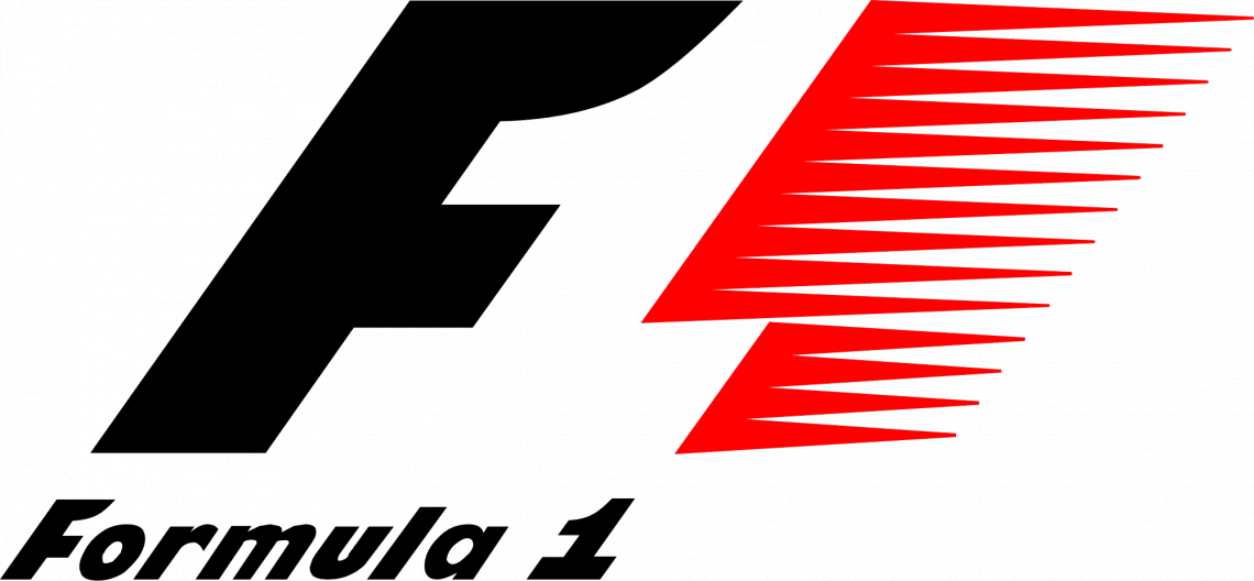
In this version of the Formula 1 logo, the negative space between the “F” and the red speed marks forms the “1.”
Negative space is one of my favorite tools in logo design because it asks the eye to participate. You see the obvious shape first, and then another image appears in the space around it.
That kind of discovery can make a logo more memorable, which matters because a logo’s real job is not simply to look good. Over time, it becomes a visual shortcut to everything someone knows about the company. Our article on building trust and brand recognition with a strong logo examines how that recognition develops.
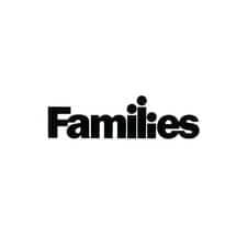
This one is easier to spot: the “ili” in “Families” becomes a tiny family inside the word itself.
The Best Idea Usually Belongs to the Brand
A hidden image is much more satisfying when you understand why it is there.
If the same trick could be dropped into the logo of fifty unrelated companies, it might be a clever design exercise, but it isn’t doing much brand work.
When the idea grows naturally out of the organization, the logo starts carrying a little piece of the story with it.

At first glance, you see the outline of Africa. Look again, and you can see two human profiles within the shape.

The Bronx Zoo mark uses giraffes as the obvious imagery. At the same time,e the negative space between their legs suggests a city skyline—an especially appropriate combination for a zoo in the Bronx.
That relationship between idea and organization is one reason professional logo design is more involved than simply making an attractive symbol. A designer is trying to solve several problems at once: recognition, reproduction, meaning, distinctiveness, longevity, and fit with the larger brand. I’ve written more about why professional logo work needs more than someone who knows how to operate design software.
A Little Personality Can Go a Long Way
A logo can also give you a glimpse of the brand’s personality without spelling it out.
Sometimes that happens through typography. Sometimes it’s color. Sometimes there’s simply a small visual gesture that makes the identity feel more playful, serious, technical, elegant, energetic, or friendly.
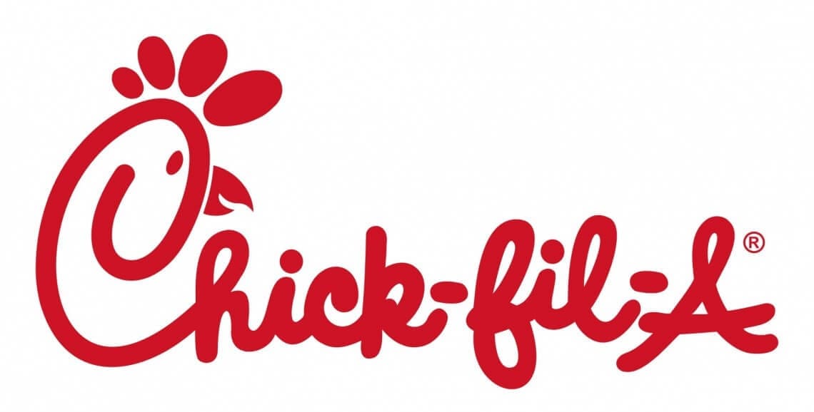
We’re admittedly partial to fowl around here. In the Chick-fil-A wordmark, the “C” also becomes the head of a chicken.
That little detail doesn’t need an instruction manual. It belongs naturally to the name and category, and it gives the wordmark personality without overwhelming it.
Place and History Can Become Part of the Mark
Some of the most interesting logos make sense only when you know something about the organization behind them. I actually like that. A logo does not need to tell a stranger the entire company story in three seconds.
It can contain something meaningful for the people who know the brand.

The University of Oregon “O” connects two recognizable athletic landmarks: the outer form references Autzen Stadium, and the interior references Hayward Field. You’d almost think it was all-sports-all-the-time in Eugene—but the academics are pretty solid, too.
There’s an important lesson here for businesses thinking about changing an established identity. A logo can accumulate meaning that isn’t obvious in the artwork itself. Before discarding familiar elements, it’s worth understanding what customers already recognize and value. That’s the idea behind evolving a logo without losing the brand equity already attached to it.
Sometimes the Concept Is More Technical
Not every hidden idea is emotional or playful. Sometimes the design is simply a smart translation of what the company does.
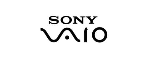
The Sony VAIO mark is commonly interpreted as bringing analog and digital together: the first portion resembles an analog waveform, while the “IO” suggests the binary digits 1 and 0.
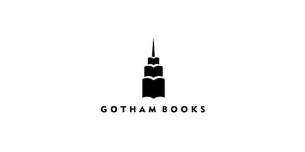
In the Gotham Books logo, stacked open books also read as a skyscraper—a nice visual connection between publishing and “Gotham.”
Neither idea is necessary for someone to recognize the mark. But once you know what you’re looking at, the concept adds another layer to the identity.
Color Matters, but It Isn’t the Whole Logo
We talk a lot about logo color because it is one of the first things people notice. It can support recognition, mood, differentiation, and the larger visual identity.
But a strong mark shouldn’t depend entirely on color to hold itself together.
If you’re working through that part of your identity, choosing your logo color is best considered in the context of the whole brand rather than starting with “What color do I like?”
The strongest logos generally have enough structure for the underlying idea to survive even when the color disappears.
Not Every Clever Logo Needs to Be Subtle
Some ideas announce themselves almost immediately, and that’s fine too.
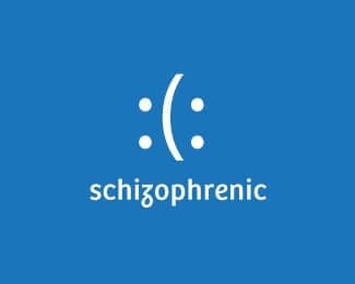
This mark uses opposing human profiles within a single form, creating a visual that changes depending on which face your eye notices first.
The important thing is not whether somebody has to work hard to “get” the idea. It is whether the idea adds something relevant without making the identity harder to use.
And Then There Are the Ducks
You knew I wasn’t going to make it through another collection of clever logos without including this one.

Admittedly, this one is still my favorite. Paradux is pronounced “pair of ducks,” and sure enough, there they are.
Our name lets us have a little fun with the identity, and the pair of ducks rewards those who make the connection. More importantly, it feels like us.
That may be the best test for any clever element in a logo. Not “Can we hide something in here?” but “Does this idea actually belong to this brand?”
Great Logo Design Has More Than One Job
Looking at collections like this can make it seem as though every great logo needs a hidden message.
It doesn’t.
A logo can be extraordinary without a visual puzzle anywhere in sight. It needs to be recognizable, usable, appropriate for the organization, flexible enough to work across different applications, and strong enough to carry recognition as the brand grows.
If there happens to be a second layer waiting for someone who pays attention, that would be wonderful.
But the hidden detail should support the identity, not become the reason the identity exists.
That is what I enjoy about the best examples here. They work before you discover the trick—and then become just a little more satisfying after you do.
And if you haven’t already, go back and see how many you can spot in Part 1 of How Observant Are You When You Look at a Logo?
Frequently Asked Questions
Does every logo need a hidden meaning?
No. Hidden meanings can add interest, but they are not a requirement for strong logo design. Recognition, clarity, flexibility, appropriateness, and connection to the larger brand matter much more than having a visual trick.
What is negative space in logo design?
Negative space is the unoccupied area around or between visual elements. Designers can use that space intentionally to create a second image or idea, allowing a logo to reveal additional meaning when someone looks more closely.
Why does logo symbolism matter?
Symbolism can connect a logo to the organization’s name, purpose, location, history, product, or personality. When the connection is meaningful, the design can communicate more about the brand without adding more visual clutter.
Should a logo still work in one color?
In most cases, yes. A strong logo should remain recognizable and functional when reproduced without its full color palette. Color can strengthen recognition and personality, but the underlying form should not depend entirely on it.
When should an established company change its logo?
A logo may need to evolve when it no longer represents the business well, performs poorly in modern applications, or the organization itself has changed significantly. Existing recognition should be considered before replacing familiar brand elements.
Tisha Oehmen is the Chief Branding Officer and co-founder of Paradux Media Group. With more than 30 years of experience in branding, marketing, and business strategy, Tisha brings a practical perspective shaped by helping businesses understand who they are, what makes them different, and how to communicate that clearly. An award-winning brand strategist and best-selling author of two books on branding, she believes the strongest brands aren’t manufactured—they’re uncovered, understood, and built to last.


What Clients Say
Mike is a wizard! We had Paradux create a video for our company. It got more than 65,000 views on YouTube in the first week….

“Tisha and Garrett have been wonderful to work with. They are very knowledgeable about websites, marketing, SEO. They have both been prompt and efficient in…

We love working with Paradux. They are very professional, always responsive, learn very quickly about a wide variety of businesses and industries, and produce first-class…
“Paradux is top notch – they know their stuff and always take excellent care of me. I get so many compliments on my website! I’ve…

We love working with Tisha and Paradux. They are professional, very responsive, and are able to dive in and learn about a wide variety of…
I loved working with Paradux on updating our website to look more modern! They are very responsive and incredibly fast at getting things done. I’m…

“Paradux worked quickly and efficiently to quickly get an ad campaign together for our biggest annual fundraising event. I will be using them every year…

“I loved working with Paradux on updating our website to look more modern! They are very responsive and incredibly fast at getting things done. I’m…

“The team at Paradux was wonderful to work with. Their expertise, assistance, grace, and personality were such a joy in our partnership on a video…
