A friend of mine recently sent me an email that’s been making the rounds lately titled “How Observant Are You?” and in it are some great logos you’ve seen – but may not have really looked at (Thanks David!). I’ll share them below, because these are great examples of the depth and layers of meanings that logos should have. So often, we see logos hastily put together, or simply a version of glorified clipart. While the company may have subsequently engaged in branding and really honed in on what their brand is, their logo doesn’t tell that story. But I think there is nothing quite so good, clever, or obviously branded as hidden messages in logos, like you’ll see below. These companies have taken a lot of time and energy to add layers and depth to logo — and by extension their brand. Take a few moments to appreciate the artistic and branding genius in these logos that you’ve probably seen many times — but never really looked at.
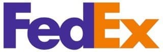
Do you see the arrow between the “E” and “x” (in white)?
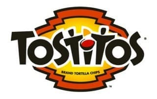
The 2nd and 3rd “T’s” are two people sharing (or fighting over) a tortilla and a bowl of salsa.
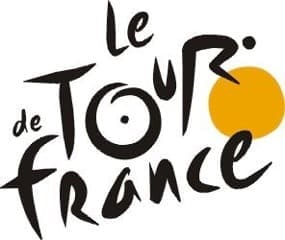
The world’s most famous bike race. The “R” in “Tour” is a cyclist. The yellow circle is the front wheel of a bicycle, the “O” is the back wheel.

The arrow means Amazon has everything from A to Z.
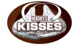
The gap between the “K” and the “I” is a sideways chocolate kiss.
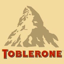
There is a dancing bear above the “BLE”. Toblerone chocolate bars originated in Berne , Switzerland , whose symbol is the bear. It features the animal on its flag and coat-of-arms.
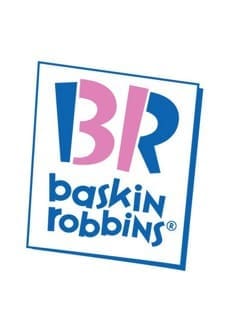
See the ” 31″ embedded in the ” BR”? Thirty one-derful flavors!
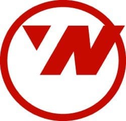
Northwest Airlines. The circle is a compass. The arrow in the upper left corner is pointing..? North West Of Course !

See the gorilla and lioness (in white) facing each other?
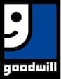
The smiley half face is also a ‘g”.
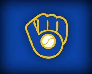
The emblem for the Milwaukee Brewers. Baseball glove forms an “M” and a “B”.


Quacktastic Reviews:
“Tisha and Garrett have been wonderful to work with. They are very knowledgeable about websites, marketing, SEO. They have both been prompt and efficient in…
We love working with Paradux. They are very professional, always responsive, learn very quickly about a wide variety of businesses and industries, and produce first-class…

“Paradux is top notch – they know their stuff and always take excellent care of me. I get so many compliments on my website! I’ve…
We love working with Tisha and Paradux. They are professional, very responsive, and are able to dive in and learn about a wide variety of…
I loved working with Paradux on updating our website to look more modern! They are very responsive and incredibly fast at getting things done. I’m…

“Paradux worked quickly and efficiently to quickly get an ad campaign together for our biggest annual fundraising event. I will be using them every year…

“I loved working with Paradux on updating our website to look more modern! They are very responsive and incredibly fast at getting things done. I’m…

“The team at Paradux was wonderful to work with. Their expertise, assistance, grace, and personality were such a joy in our partnership on a video…

Always willing to work with us on our (sometimes very specific) marketing needs.