
By now, you’ve probably heard that Starbucks has introduced a new logo, moving into the realm of iconic brands like Apple and Nike—a logo without words. It’s a bold move that few companies have the brand equity to pull off. However, given Starbucks’s significant market share and global presence, they are positioned better than most to make this leap. Many brand advisors aspire to this evolution, so unsurprisingly, Starbucks is attempting it.
Why Change the Logo?
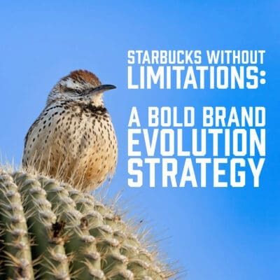 Whatever your opinion of the new logo, the probable reasons for the change make sense. Consider the challenge of operating an international brand when the logo is tied to a specific language—in this case, English—and the word “coffee.” Starbucks has expanded its offerings for years, from teas to hot chocolate and various food items. Yet, the name and logo still define them primarily as a coffee company: “Starbucks COFFEE.” While coffee remains central to the Starbucks experience, limiting its logo to that one product category restricts the brand’s potential. The new logo frees Starbucks from this limitation, allowing the company to expand globally without the constraint of language or being overly defined by one product.
Lessons for Your Brand: The Power of a Flexible Identity
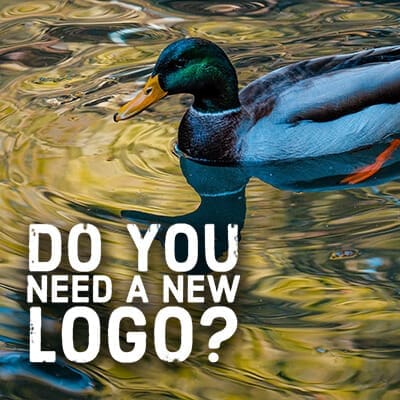
Starbucks’s decision is a powerful reminder for businesses at any stage of development. If you’re designing a logo or considering a name change, thinking long-term about your brand evolution strategy is essential. Even if your business isn’t large enough to drop its name from the logo entirely, consider the limitations your current branding might impose. For example, if your logo includes words that narrowly define your offerings—such as “coffee,” “pizza,” or “bakery”—you may find it challenging to branch out into new areas later. Your brand identity should allow growth and flexibility, not box you into one product or service category.
A Long-Term View: The Third Place Concept
If Starbucks had taken a long-term view of its brand identity 20 years ago, it might have minimized its focus on coffee and emphasized its broader concept of the Third Place—a space between home and work where people gather, relax, and connect. This concept is at the heart of what Starbucks truly represents, and this more expansive definition will allow the company to evolve and grow. By shifting its logo and removing the word “coffee,” Starbucks is positioning itself for the future. The new branding enables it to enter new markets and product categories, with coffee remaining a core component but no longer the sole focus.
The Takeaway: Evolving Your Brand for the Future
Whether you love or hate the new Starbucks logo, it’s a strategic move that reflects a broader brand evolution strategy. It allows Starbucks to see its brand beyond coffee and adapt to the ever-changing marketplace. This approach is a valuable lesson for any business, reminding us that our brands must be flexible and ready for growth. As you consider your business, consider how your brand identity positions you for the future. Are there limitations in your name or logo that might restrict your ability to grow? Now might be the time to consider how you can evolve your brand, ensuring that it remains relevant and open to new opportunities.


Quacktastic Reviews:
“Tisha and Garrett have been wonderful to work with. They are very knowledgeable about websites, marketing, SEO. They have both been prompt and efficient in…
We love working with Paradux. They are very professional, always responsive, learn very quickly about a wide variety of businesses and industries, and produce first-class…

“Paradux is top notch – they know their stuff and always take excellent care of me. I get so many compliments on my website! I’ve…
We love working with Tisha and Paradux. They are professional, very responsive, and are able to dive in and learn about a wide variety of…
I loved working with Paradux on updating our website to look more modern! They are very responsive and incredibly fast at getting things done. I’m…

“Paradux worked quickly and efficiently to quickly get an ad campaign together for our biggest annual fundraising event. I will be using them every year…

“I loved working with Paradux on updating our website to look more modern! They are very responsive and incredibly fast at getting things done. I’m…

“The team at Paradux was wonderful to work with. Their expertise, assistance, grace, and personality were such a joy in our partnership on a video…

Always willing to work with us on our (sometimes very specific) marketing needs.
You’re one of the few that support the change, and I agree with you.
The critique of the logo on the web-o-sphere shows how important logos are to a company, and change, in this case, is something most people don’t like. Rhetorically, regardless of your discipline in branding or marketing, YOU are a consumer of the brand, and you have opinions of change.
Whether you like it or not, there are two things that are apparent: 1. Starbucks needed to do this to grow their business in the right ways (you’re right.) 2. After a year, no one will fuss.
Visually, I agree – it’s not as strong as the old logo. But it’s so freeing for them that it’s worth the risk. I agree, in a year, it’ll be a non-issue.